INTERNSHIP PROJECT
02 · Ardent Privacy · 2026
Data Discovery · Enterprise SaaS · UX Design Internship
Role: UX Designer
Timeline: Mar – May 2026
Platform: B2B SaaS Web
Team: Solo Designer (Me) & Engineer (Abhijit)
6 → 2
Redundant cards consolidated
1
Mislabeled tile corrected
New
Sensitive Data Minimization module shipped
3
States designed (populated, expanded, zero-data)
I was the UX Designer on this project. Abhijit, the engineer who had built the initial version of the dashboard, worked closely with me throughout, from diagnosing what wasn't working to implementing the final design. The project ran from March to May 2026, interspersed with other work rather than as a single continuous sprint.

Hi!
MY ROLE
BRIEF
A dashboard three demos couldn't sell.
Ardent Privacy's Data Discovery dashboard helps enterprise data privacy teams identify and manage sensitive data across their systems. The existing design had grown fragmented over time with six separate risk cards, inconsistent labeling, and visualizations that were hard to read at a glance. I led the UX redesign of this dashboard, working closely with the engineer who built the original version, to make it clearer and more usable for the range of stakeholders who actually rely on it.
PROBLEM
One dashboard, three separate reasons it didn't work.
The signal to redesign came from multiple directions before it became a formal project. Client and internal demos had repeatedly flagged the existing dashboard as unintuitive, something prospective and current customers struggled to read at a glance. Eventually, our CEO caught the same issue firsthand during a demo, which turned it into a priority.
Fragmented Information
Six separate structured/unstructured risk cards made it hard to get a clear picture of overall risk at a glance.
Inconsistent Labeling
The dashboard used "applications" and "assets" interchangeably in places where the Overview dashboard used only "asset", a small inconsistency that added confusion for users trying to cross-reference data.
Audience Mismatch
The dashboard's day-to-day user is typically a data privacy officer, but the information needed to be legible to more senior stakeholders (CISOs, CROs, and CFOs) who might only check in periodically and need to understand risk status quickly.
THE CONSTRAINT

“The same dashboard. The same sections. But a different, more intuitive feel.”
Leadership set one rule before I started: keep the existing colors, table structures, and button patterns. No rebuild. Honestly, I wanted more room to rework the layout but the team wanted the dashboard to feel different, while insisting the underlying sections stay the same, which is its own kind of design problem. Working inside that constraint sharpened the work, though. With visual style off the table, every change had to justify itself on clarity and usability alone, not aesthetics.
KEY DECISIONS
Four changes, one net-new feature.
01
Fixing the mislabeled tile
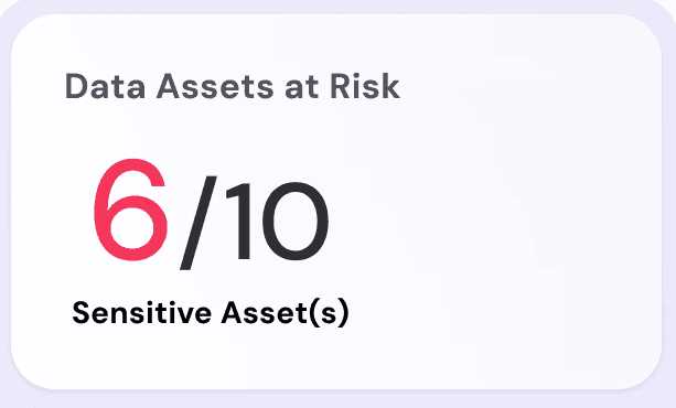
The original ‘Total Applications’ card showed 6 sensitive / 10 total assets but that’s asset data, not application data. I caught this myself and renamed it ‘Data Assets at Risk,’ matching the language used everywhere else on the dashboard.

Before
After
02
Consolidating six cards into two
The original screen repeated the same record/file breakdown six times, once per data source type. I converged these into two unified modules, Sensitive Records at Risk and Sensitive Files at Risk, each leading with one headline number, with the same breakdown available underneath via tabs instead of six competing tiles.

03
Adding a module that didn’t exist: Sensitive Data Minimization
This was entirely new. It shows, per data type, how many files still need minimizing against the total scanned with a plain percentage and a status flag rather than raw numbers alone. It’s designed to answer one question fast: is there something I need to act on right now?

Fully Populated State
04
Designing for three states, not one
The Sensitive Data Minimization section needed three real conditions: fully populated, drilled-into detail, and brand new, with nothing connected yet. Rather than let that last state default to a blank chart, I designed it to prompt the obvious next action. It’s a small thing, but it’s the difference between a tool that looks broken on day one and one that tells a new user what to do next.

Unpopulated State
To explore the new Sensitive Data Minimization module quickly, I used Figma Make to generate several visualization approaches before landing on the final version. It let me compare options against real content density in minutes rather than building each variant by hand, though the actual call on what best answered the "do I need to act now?" question was still mine.
A decision I didn’t fully win
Leadership wanted a large hero banner introducing the module. I pushed for something smaller and quieter. I was worried a big, bold banner would reintroduce exactly the kind of visual noise I was trying to remove. The CEO held firm on size, and the larger banner is what shipped. I don’t think this made the dashboard worse, but it taught there would always be time where I would need to go with the client's decisions than my own design logic. I did succeed in reducing the information on it to not make it cluttered.


My proposed design
What shipped
Designing for three Readers, one Operator.
HOW DO I DESIGN FOR DIFFERENT target audiences?
The person actually running this tool day-to-day was a data privacy officer. But the dashboard also had to hold up for CISOs, CROs, and CFOs, people who’d check in occasionally, without the operator’s context, and needed to trust what they saw within seconds. That split audience is why the top-level view leads with a small number of high-stakes figures and pushes granular detail one click deeper. I designed the information hierarchy and visualizations to be legible at a glance for someone checking in periodically, not just for the power user working in it every day.
Before

OUTCOME
The redesign shipped into the live product. There’s no formal usage-analytics pipeline on this internal enterprise tool, so rather than manufacture a metric that doesn’t exist, six redundant cards became two, a mislabeled tile was corrected, a net-new Minimization module closed a real coverage gap flagged in earlier demos, and the product went from something repeatedly called out as unclear in front of clients to a shipped, stakeholder-approved redesign. The engineer I partnered with throughout gave positive feedback on the collaboration and the resulting design.
“Her work on wireframes, UI designs, and design assets was always thoughtful and well-executed… She was proactive in refining her designs, paid close attention to details, and worked well with everyone on the team.”
Abhijit, Engineer, original interface builder
Before
Data Minimization Dashboard
After

Data Minimization Dashboard -Expanded View

IMAGE 2 — Redesigned overview
Data Minimization Dashboard - No Sensitive Data
REFLECTION
What I’d do with more time.
I’d push to actually implement the typography research I did during this project. I’d recommended Inter over the existing DM Sans for better numeric density and table readability at this kind of data scale, benchmarked against tools like Linear and Grafana, but the product kept its existing type system in the interest of scope. I’d also want to build out an idea my CEO and I kept circling back to but never scoped formally, an AI chat-based way to query this data, instead of only ever navigating to it through static dashboards.