INTERNSHIP PROJECT
01 · Ardent Privacy · 2026
Consent Management · Enterprise SaaS
Role: UX Designer
Timeline: Mar – May 2026
Platform: B2B SaaS Web
Team: Solo Designer (Me), Product Manager, Engineering team
INTRO
What is UCM?
Universal Consent Manager is Ardent's consent management platform. It lets organizations onboard their applications, build and manage consent dialogs, and gives users a way to review, change, or take back their consent whenever they want. It was built alongside Data Discovery, but where Data Discovery is about finding and governing sensitive data, UCM is about collecting and honoring consent.
I worked on several parts of UCM, but this case study focuses on the part where I spent the most time: redesigning the Admin dashboard and creating role specific dashboards for Managers and Clients.
There was already one dashboard in the product, an Admin dashboard, built before I joined the project. As the platform grew, it became clear that a single dashboard couldn't serve everyone using it. I revamped the existing Admin dashboard and designed two new dashboards for Managers and End Users from the ground up. I worked closely with the Product Manager and engineering team through several rounds of design review.

Hi!
MY ROLE
BRIEF
Why was this needed?
UCM had to work for three very different kinds of users: administrators, managers, and end users, each with their own responsibilities in the consent lifecycle. The existing Admin dashboard tried to serve everyone from one view, which meant none of them could easily find what actually mattered to their role.
This was a planned initiative that took shape through ongoing stakeholder conversations as we figured out what each role actually needed to see and do.

Starting point: The existing design
THE CHALLENGE
Initial explorations and learnings
There was already an Admin dashboard in the product before I joined, and my first task was to redesign it and share with the team some new designs. It wasn't unusable, but it was crowded and lacked a clear information hierarchy. As the project developed, it became clear that UCM also needed separate dashboards for Managers and Clients, so the work grew from redesigning one dashboard into designing three. Some of the major explorations are as below:

Exploration 1:
Focusing on overall layout and cards.
Exploration 2:
Focusing on how I could highlight the important card. This didn't work
because it was creating an unbalanced white space.


Exploration 3:
Switched from a list view to card view for a more visual depiction.
In an early review, Ashutosh, one of the Managers on the project, gave feedback that shaped everything after it: the dashboard needed to feel more intuitive, it was too crowded, and we should rely more on "click and view" interactions instead of showing everything at once. That feedback pushed me to rethink the hierarchy: what needs to be visible immediately, and what can live one click away.
COMPETITIVE ANALYSIS
Part of the project I learned the most from.
As part of the early exploration, I looked at how established players in the space approached their dashboards. OneTrust leaned on consent analytics, purpose breakdowns, and compliance readiness information. Didomi showed implementation status and consent metrics with heavy filtering by device, domain, and region. Usercentrics was built around consent trends and performance analytics. Ketch focused more on orchestration and enforcement. This wasn't formal user research, it was competitive analysis, but it shaped my early concepts. I started designing toward the same kind of compliance oriented information: overall compliance, non-compliance, risk and violation style indicators, and jurisdiction status.
THE PIVOT
What changed?
Through stakeholder and product discussions, it became clear that framing didn't fit what we were actually building.
What UCM tracks
Consent given
Consent status
Consent history
What a compliance
score needs
Regulatory mapping
Violation detection
Jurisdiction rules
UCM is a consent collection and management system. It records whether someone consented, their consent status, and their consent history. It isn't a compliance or violation detection system, and it never had the data to back up something like an overall compliance score. Showing that kind of metric would have implied a level of regulatory assessment the product simply couldn't support.
That realization moved the dashboards away from borrowed compliance patterns and toward operational visibility: showing the actual state of applications, consent, and dialogs, instead of a number that looked authoritative but wasn't grounded in anything real.
SOLUTION
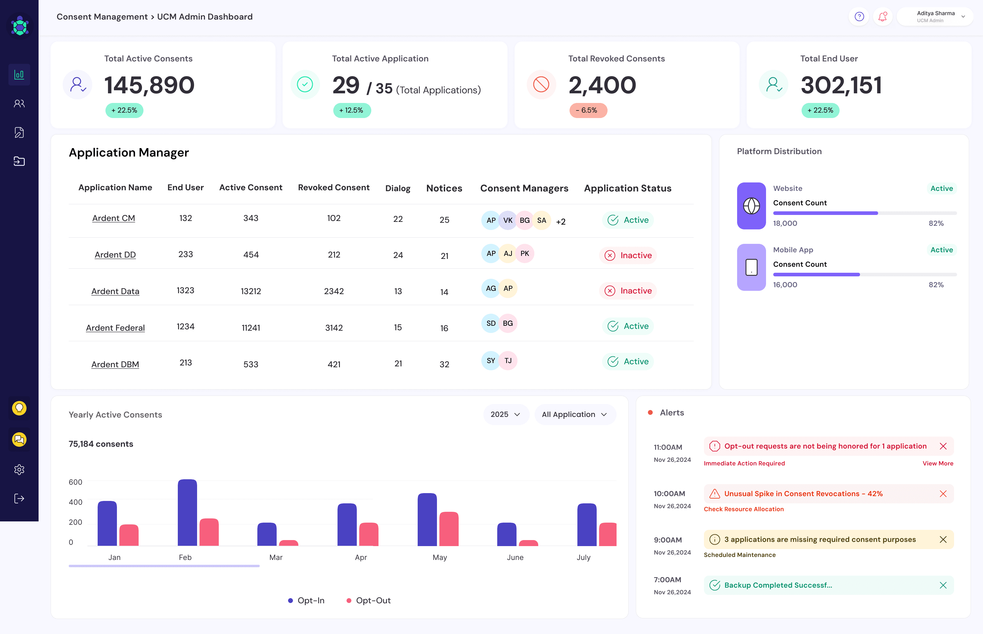
First, the Admin Dashboard
This is where most of the actual exploration happened, and it took a long list of iterations to get right. I explored through different information hierarchies, different chart types, different ways of representing application status, and different levels of detail shown upfront versus tucked behind a click.
Part of the Process:
In the middle, I and the team also discussed adding different components like Compliance by Region and Application Review Queue. I scrapped it since discussions showed that it was not a must have for Admin.

There wasn't one dramatic moment where it suddenly clicked. It came together through iteration: cutting information that wasn't essential, moving platform distribution down the hierarchy the way Ashutosh had suggested, and eventually removing the compliance and violation concepts that the product couldn't actually support. What was left was a dashboard built around applications, registration numbers, consent statistics, user management, notifications, and application state.
OUTCOME
Scaling the system
Once the Admin dashboard's structure felt solid, I carried that same system into the Manager and Client dashboards instead of starting over. The layout, the stat bar, the row of application cards, the line chart, all stayed consistent. What changed was what each role actually needed to see.
Admin Dashboard
Top row answers ‘is everything okay?’ in one scan. ‘Today’s Overview’ panel surfaces what needs action. Application carousel with flip cards below. Trend graph and platform breakdown at the bottom. Priority first, detail below.

Manager Dashboard
Managers needed to understand the state of dialogs and applications moving through the system: which were active, which were pending, and specifically where something was stuck and who it was waiting on. A dialog just saying "pending" wasn't useful on its own, a Manager needed to see where it was stuck and with whom. So their dashboard added a table built around workflow and status, along with filtering, since a Manager could have several applications assigned to them at once.

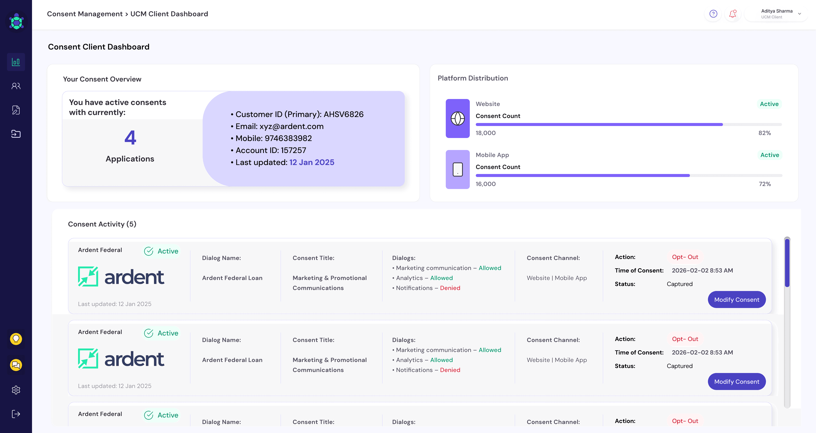
Client Dashboard
Clients are the organizations using UCM to manage consent for their own users, not the end users themselves. Their dashboard needed to answer a narrower set of questions: which applications and dialogs they'd collected consent through, what their current consent status looked like, and when and where that consent was given, with a clear way to modify or withdraw it. So the Client dashboard kept the same core layout but swapped the operational tables for a more direct, consent focused view.
OUTCOME
What I’d do with more time.
No formal user testing happened on any of the three dashboards. Everything I designed went through internal stakeholder and product reviews, not usability sessions with actual admins, managers, or clients.
Admin also got the bulk of my time and attention, since it was the existing dashboard we were reworking from the ground up. Manager and Client were built on top of that established system afterward. If I'd had more time, Client is the one I would have pushed further, specifically validating whether consent history and the modify or withdraw actions were presented as clearly as they could be.
Learnings from this project.
The biggest lesson I took from UCM was that a good dashboard isn't defined by how much information it can display. It's defined by whether every piece of information actually earns its place. I started by looking at what established products in the category were showing. I ended by asking a more useful question: what can our product actually show the users, and what does each role actually need to do their job. That shift is what shaped the final system, and it's also what I'm most proud of, not any single screen, but the fact that Admin, Manager, and Client ended up as one shared system instead of three unrelated designs.